What to Wear to Your Photo Shoot: A Guide You Can Send to Clients
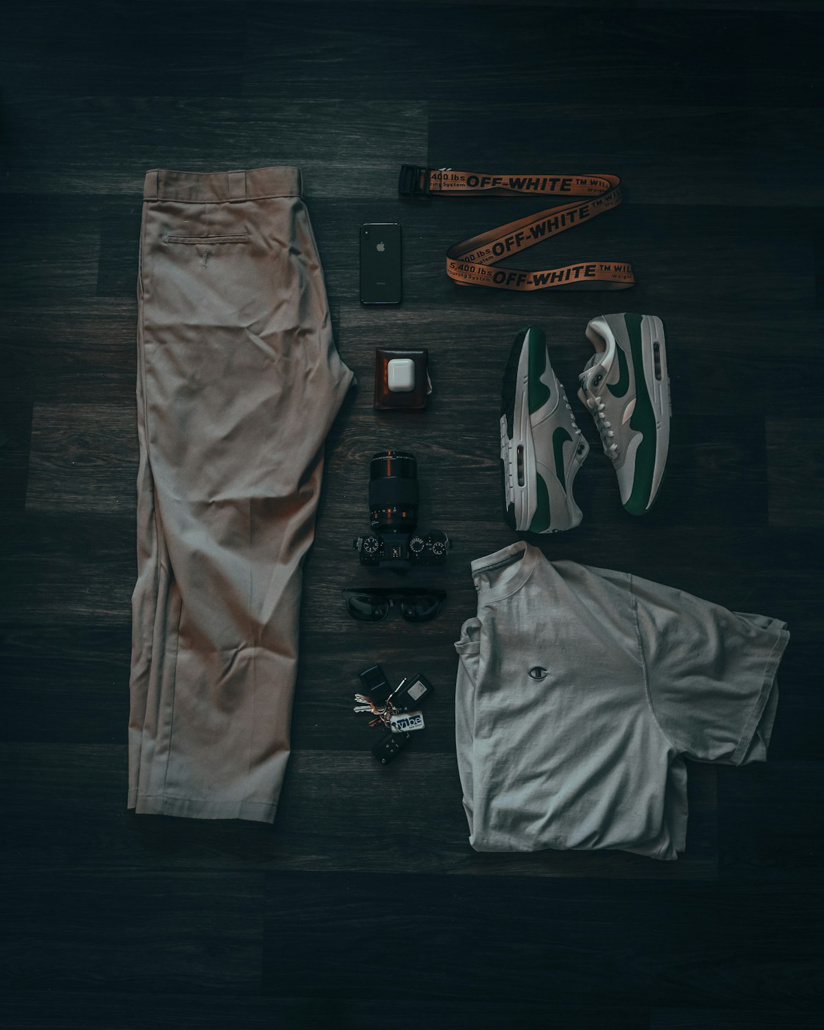
If you have shot for more than a few clients, you already know the question that shows up in nearly every pre-shoot email: what should we wear? It is worth having a clear answer ready, because a well-dressed, well-coordinated group photographs beautifully almost regardless of location or light, while mismatched or overly busy outfits fight the photos no matter how good the shoot itself is. This is written so you can forward it straight to a client as-is, or adapt it to your own voice.
Coordinate, do not match
The advice clients usually remember, and get wrong, is matching. Head-to-toe identical outfits read as costume-like in photographs and date quickly. What actually works is coordination: everyone pulling from the same color palette without wearing the exact same thing. Pick two or three complementary colors and let each person interpret them their own way, a solid top here, a patterned skirt there, all sitting comfortably in the same tonal family. This gives a photo cohesion without looking staged.
Favor solid colors and small, simple patterns
Solid colors and fine, simple textures photograph more predictably than bold graphics. Large logos, busy patterns, and text on clothing pull the eye away from faces, and certain tight repeating patterns can create a visual buzzing effect in photos called moiré. A few well-placed patterns are fine as accents, but if more than one person in a group photo is wearing a loud print, the eye will not know where to land.
Think about the setting
…
Read the full story at FrameCourier
Related stories
News · Newsshooter
Jackery Explorer 100D– a 96Wh, 850 g Portable Power Station

News · DIY Photography
World’s Largest Optical Telescope ELT Tilts for the First Time
News · Newsshooter